
Redesigning the Angry Birds 2 UI: A Cleaner, More Modern Look
- Nov 18, 2025
- 2 min read

Redesigning the UI for Angry Birds 2
When you’ve played a mobile game as iconic as Angry Birds 2, you start to notice the little details in the interface — what feels smooth, what feels crowded, and what could work better. As a UI designer, those details stand out instantly.
This wasn’t a project about reinventing the game or changing its gameplay. Instead, it was simply an exploration: What if Angry Birds 2 had a cleaner, more modern interface with improved spacing and visual clarity?
My goal was to keep the charm and energy of the original game, while polishing the UI so it feels easier on the eyes and more intuitive for players.


Where I Started
Angry Birds is known for its bold identity:
strong outlines
bright color palette
cartoon-inspired shapes
playful character style
But the UI can feel busy at times, especially for new or casual players. So my redesign focused on:
reducing visual clutter
improving spacing
simplifying navigation
modernizing the overall look
It’s not a replacement — just a refined version of something already beloved.
My Design Goals
1. Clean Up Spacing & Layout
One of the biggest opportunities was improving the spacing between icons, text, and buttons. Increasing padding and separating content made the screen feel far less crowded.
2. Simplify Navigation
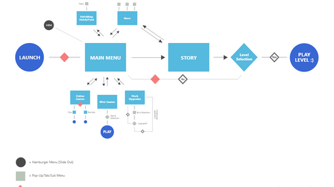
The original navigation bars can feel a bit dense. I reorganized the layout to create:
clearer icon hierarchy
fewer competing visual elements
more intuitive access to primary actions
Cleaner navigation = smoother gameplay experience.
3. Modernize the Visual Style
I softened some of the heavy shadows and outlines to give the UI a more updated, polished look.
Changes included:
more balanced icon sizing
smoother gradients
lighter visual weight
better contrast management
The result keeps the Angry Birds personality but aligns it with modern UI standards.
4. Improve Button Hierarchy
I adjusted the button sizes and color contrast so players intuitively know what the primary and secondary actions are. This helps guide users when the screen is filled with options.
The Updated Interface
In my refined UI concept, I focused on:
reducing visual noise
creating a cleaner top header bar
refining icons to feel more consistent
improving text readability
grouping UI elements more logically
using space as a design tool
The game still looks like Angry Birds — it just feels more organized and easier to read at a glance.
What I Learned from This UI Exploration
Games with bold art styles benefit greatly from simplified UI
Even small spacing adjustments can dramatically improve usability
You don’t need a full redesign to modernize an interface
Respecting the original art style is key in any game-related redesign
This exercise sharpened my eye for hierarchy, spacing, and visual clarity — the same principles I bring to client websites and UI projects today.
Need UI or Website Design Support?
At Ember & Forge, we help small businesses create clear, modern digital experiences — whether through websites, UI design, or ongoing marketing support. Explore our services here.
Interested in deeper insights for this project including wireframes, user research, testing, and more? Click here for the full case study.

Ember & Forge builds websites, UI design, and marketing support for small businesses — without long-term contracts or agency runaround.


Comments