
How I Redesigned the iOS Calculator (Daily UI Challenge)
- Nov 17, 2025
- 3 min read

How I Redesigned the iOS Calculator (Daily UI Challenge)
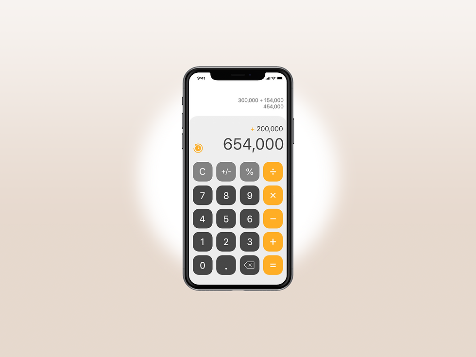
For Daily UI Challenge, the prompt was simple: redesign a calculator. Naturally, I decided to take one of the most familiar calculators in the world — the iOS version — and give it a modern refresh. Instead of doing a wild, experimental concept, I wanted to re-imagine the existing interface in a way that felt cleaner, more polished, and easier to use for everyday calculations.
This wasn’t about reinventing the wheel; it was about refining what millions of people already use.
My Goals for the Redesign
When approaching the challenge, I set three main goals:
1. Make the interface cleaner and more modern
The original iOS calculator uses heavy shadows, thick outlines, and rounded buttons that visually date the design. I wanted a sleeker, more simplified UI that still felt familiar.
2. Improve spacing and readability
Many calculator apps crowd the number pad and operators together, causing mis-taps. I increased spacing and improved the hierarchy so each button has more breathing room.
3. Add subtle visual cues without clutter
I introduced simple gradients and color variation to help users quickly distinguish operators, functions, and numbers without overwhelming the interface.
Overall, the goal was minimalism — but with just enough contrast to guide the eye.
Design Choices & Why They Work
Cleaner Color Palette
I opted for a slate-gray background paired with clean white and soft orange accents. This provides:
excellent contrast
professional visual tone
a modern, almost “pro app” feel
Orange was used sparingly to highlight primary actions (like the “equals” button), making the important controls stand out instantly.
Simplified Button Layout
I redesigned the button grid to:
reduce visual clutter
improve spacing around touch targets
maintain consistent alignment
elongate key function buttons
This increases usability on small screens and reduces the chance of tapping the wrong number.
Modern Typography
Changing the font to a more contemporary, geometric style instantly updated the look. Numbers appear sharper and easier to read — especially at a glance.
Subtle Depth, Not Heavy Shadows
The original app has strong 3D shadows that make it feel bulky. I used softer layering for a cleaner, flatter interface that still feels tactile.

What I Would Improve With More Time
If this wasn’t a Daily UI sprint, I’d explore:
a scientific mode redesign
haptic interaction patterns
gesture-based operations
color-blind accessibility options
alternate themes (dark, high-contrast, neon, etc.)
Even small details like micro-animations could add delight without slowing the experience.
Why Challenges Like This Matter
Daily UI challenges are great for sharpening your UI instincts — not because you reinvent apps, but because you rethink them. They force you to consider:
spacing
contrast
hierarchy
usability
user behavior
visual clarity
And when you apply this level of thought to a small app like a calculator, it improves how you design larger, more complex interfaces. This same approach is what I bring into every website and UI project I work on at Ember & Forge.
Need UI or Website Design Support?
If you like this type of design thinking, it’s exactly what we bring to small businesses at Ember & Forge — clear, modern interfaces that make your brand easy to understand and easy to trust.
Whether you need a new website or ongoing design + marketing help, explore our services.

Ember & Forge helps small businesses grow through better websites, clear design, and honest marketing — without contracts or agency runaround. Learn more on our Services page.


Comments